Friday, March 28, 2008

T & A Edition with Power Girl and Vampirella

Here's how this works: I finish reading something, and I tell you about it, and I try not to bore you to death.


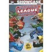
I found a used copy of this and... well. When I was a little kid (little kid, y'all dirty-minders, before Bart Sears gave her the biggest breasts in mainstream comics), I really liked Power Girl, but on the strength of the episodes reprinted here, and in some recent collections of '70s Justice Society titles, heaven only knows why. She's an abrasive character and her stories (these by Paul Levitz) are incredibly overwritten, with hideously rushed art by Joe Staton.

DC Comics has revamped and revised their continuities several times, and Power Girl has always been on the shit end of these odd editorial decisions, so this bizarre book collects stories from three iterations of the character. It culminates in a four-part miniseries from a couple of years ago, when Geoff Johns and Amanda Palmer tried to finally "work out" her origin. They couldn't do this by just issuing a new editorial fiat and starting fresh, because that would make sense. Instead, it's a braincurdling mess where various characters remember all these discarded old comic stories and if you, the reader, don't, tough fucking luck, because this book won't make any sense whatsoever.

To their credit, Johns and Palmer do make the character much more fun and vibrant, and you have to laugh at her patience with every male stealing a glance at her mammoth hooters, but it really is a missed opportunity. I had a good giggle when Jimmy Olsen sneaks a peek, anyway. By far the best thing about this book, and the only reason I would recommend it, is Conner's art, which has improved remarkably in recent years, and which I would love to see more of. The only DCU book I buy these days is Legion of Super-Heroes, which currently has terrible art. Can Ms. Conner draw that, please, Mr. DiDio?


Oddly enough, Amanda Conner also drew three episodes of Vampirella sometime in the mid-90s, but I don't like the style she was using then as much, although her pages are streets ahead of the three issues that followed her. I never read Vampirella before this collection of eight episodes by Grant Morrison and Mark Millar was released a couple of years ago. A reread doesn't persuade me I should've bothered. I do not understand Vampirella at all.

It's like this... I understand why superhero comics will have Power Girls with big bosoms, and why everybody from your Mary Janes to your Storms will have shower scenes with strategically placed thought bubbles or wisps of steam to hide the nudity. It's to titilate twelve-year olds, so kids can think "oooh, if only this word balloon wasn't here, I could see a nipple!" But kids aren't supposed to buy Vampirella comics, are they? So why does a comic with such patently adult-skewing business as this resort to the same silly artistic censorship as a book only kids can buy? Who's the target audience for this? (I probably don't want the answer to that question.)

As for the writing, it's much of what you'd expect from the mid-90s Morrison/Millar team, with high-concept oddness that reads like Invisibles-Lite in places filtered through the same "I'll keep you alive in torment for decades" tough guy schmaltz that made their 2000 AD collaborations such a struggle to read. There's even a character who survived an incident in the book and, thirty years later, came back to change history, kind of like Ragged Robin. And there are Anti-Vaticans and Judas Iscariots and serial killers that exist as viruses which take over people, kind of like John Sublime from his X-Men.

So there's just enough Grant Morrison fun to make this at least low-priority for his fans, but just enough Millar to temper it, and just enough confusing art to make it look like some of Morrison's more frustrating (non-Yeowell, non-Bond, non-Quitely) comics, where you're supposed to figure out what's going on based on something a minor character in the third panel on page twelve does and the artist forgets to draw.

Incidental to the proceedings, there's a tough-talking babe in a red one-piece who gets tied up and caressed by half-naked ladies every thirty pages or so. Just don't expect any payoff. Recommended if you really want everything Morrison's written, and have already shelled out for his crummy Spawn fill-ins and Mystery Play.

(Originally posted March 28, 2008 at hipsterdad's LJ.)

Wednesday, March 26, 2008

Jeff Hawke vol. one and Droid Life

Here's how this works: I finish reading something, and I tell you about it, and I try not to bore you to death.


Titan's ever-growing series of great old reprints continues with Jeff Hawke, a great old science fiction newspaper serial that started in 1954 and ran for twenty years. Their first new volume compiles four stories from 1960-61, which saw Willie Patterson joining artist Sydney Jordan for some remarkably inventive and clever tales of alien law and morality. The art's a downright treat, and you can see why they got Brian Bolland and Dave Gibbons to provide cover endorsements, as both men were clearly influenced by Jordan. One of Bolland's first pro jobs, incidentally, was inking Jordan in 1974-75. All four stories are very good, but "Wondrous Lamp," which goes from the tale of Aladdin to matter-transmission coils to having a mean li'l housecat become one of Earth's greatest defenders, might be the best of them. Highly recommended!


...but then there's this. If Cat Sullivan's Droid Life was a webcomic, its audience would dwarf even Achewood's. Recently, I've been a little guarded in recommending 2000 AD collections, as they've not proven quite as punchy in collected form as I'd thought. The reverse is true here, where what's often amusing as a weekly four-panel gag strip becomes absolutely riotous when read in one sitting. I am unhappy with the price - £7 is awfully steep for a book so small, especially with the dollar so infernally weak - but this book includes the disembodied brain of Sylvester McCoy as a recurring character, and one strip's punch line is "Easy-peasy TV emcee AC/DC BC VCs," and consequently it's worth twice the price. Highly, highly recommended!

(Originally posted March 26, 2008 at hipsterdad's LJ.)

Friday, March 21, 2008

Terrifying Horror Edition, with Caballistics Inc. and the Corpse Delivery Service

Here's how this works: I finish reading something, and I tell you about it, and I try not to bore you to death.


Oddly, I didn't enjoy this as much as I was planning to - Gordon Rennie really works out some long-running, slow burn subplots and what seems like it's taking forever when published in sporadic weekly episodes really does satisfy even more when compiled. But while these stories of an occult investigation team in present-day Britain are entertaining, the book is sorely lacking a "story so far" catchup. For example, the book begins with an episode in which an Israeli special forces team shows up to execute a member of Caballistics Inc. for an old war crime, but all of that backstory, much of which I'd forgotten, was explained in the first volume, 2006's Going Underground. People who already enjoy this series will probably really like this book, but a little more work might have been done to make this collected edition more palatable to new readers. Recommended for fans of Hellboy and Necronauts, with hopes for a little more backstory included on new or future editions to make each book stand out a little better.


The Kurosagi Corpse Delivery Service appears monthly in the Japanese anthology Shonen Ace and is written by Eiji Otsuka and drawn by Housui Yamazaki, the creator of the occult thriller Mail. Each of these collected editions - there are six now, from Dark Horse - compiles four episodes of the series, in which five recent college graduates, each with some psychic power, form a company to help the deceased fulfill their final wishes. This usually has them stumbling onto unsolved murders or old conspiracies, and despite a tendency towards villain-of-the-week syndrome, it's done with a good deal of style and wit, in equal measures humorous and creepy. I don't feel like I've gotten to know any of the individual characters yet, though. Recommended.

(Originally posted March 21, 2008 at hipsterdad's LJ.)

Thursday, March 20, 2008

Mighty Marvel Mediocrity Edition, with Power Man, Iron Fist and Captain Britain

Here's how this works: I finish reading something, and I tell you about it, and I try not to bore you to death.


Oh, the things I buy when I find a sale. Honestly, when I was young, my taste in Marvel books ran towards the odder, like The Defenders and Ghost Rider - inasmuch as any title with Don Perlin's workhorse art could be described as even slightly "odd" - and I never actually read a single issue of Power Man and Iron Fist before now, and so I was curious what it might be like. I didn't miss much. Most of the book is written by Mary Jo Duffy, and she keeps things moving at a pretty brisk pace, with a good supporting cast and subplots that keep your interest, but in the end, these stories are toothless and uninspiring, and to label them as "essential" is not in any way accurate. Recommended for under-twelves.


The first thing that struck me when looking at this collection is how godawful the coloring is. There exists a subset of superhero nerd which cannot stand looking at black and white funnybooks, ignoring the simple fact that work designed and balanced for blacks, whites and grays always looks hideous when color is applied to it. It is for these numbskulls that Alan Davis's artwork, which was the best thing about this material, is butchered.

The next thing that struck me was how primitive the early episodes looked and felt. This fault is shared between the lettering by Jenny O'Connor, which put me in mind of a high schooler's efforts, and the actual words the poor soul had to stick in them. Alan Moore hadn't yet learned to edit himself at all yet, and the result is garishly overwordy, a poor imitation of Roy Thomas and Chris Claremont, with characters agonizingly relating not merely complete sentences but giant novels of soul-searching in thought bubbles.

The story is an interlocking series of tales from an epic called "Jaspers' Warp," told across two years (1981-83?) of Marvel UK's various reprint anthologies in episodes of 8-10 pages each. The book does not include the opening six or seven episodes, which were scripted by a guy named Dave Thorpe, nor does it include a "story so far" explanation. To be fair, after about forty pages of barely readable schlock, around the time Steve Potter shows up to make the lettering look better, Moore settles down and what looks to be a good story gets going. But no sooner does the threat get serious and I was looking forward to watching our hero and his gang struggle against Jim Jaspers' government getting out of control does the story suddenly jump forward in time, Jaspers already victorious. What's left is typical convoluted Marvel storytelling, with cosmic entities manipulating the action and reality-warping superpowerful creatures exchanging blows on scales unimaginable to mere mortals, like our quickly-sidelined heroes. It's nothing that hadn't already been done before and better in any number of Marvel books in the sixties and seventies. Okay, "Captain Airbase-One" is funny, and a cute foreshadowing of the third League of Extraordinary Gentlemen volume, but otherwise this is recommended only to Alan Moore completists who've already read everything else they can find by the writer.

(Originally posted March 20, 2008 at hipsterdad's LJ.)

Saturday, March 15, 2008

Period piece edition of What I Just Read: Emma vol. 7 and The Red Seas vol. 1

Here's how this works: I finish reading something, and I tell you about it, and I try not to bore you to death.


Well-l-l-l-l... it was okay. There's a bizarre sense of time in this edition, like a trip to and from America is a simple jaunt and not a couple of months in a ship crossing the ocean. Everything ends somewhat satisfactorily, but the viscount doesn't get the comeuppance I was hoping for. And Eleanor, Jesus, what a drip. I started the series captivated by the story and the art, but by the end, I was only thrilled by the art. In the end, not particularly recommended, but I'm willing to give Kaoru Mori's next series Shirley a try since I like her art so much.


It's a rip-roaring tale of pirates on the high seas in the 1760s, led by the dashing Captain Jack Dancer. (The character's name predates that Sparrow fella by about a year, but Sparrow's a little more compelling to this viewer.) The series is full of brilliant period art by Steve Yeowell, who can draw anything and make it look great, excellent villains, and high concepts like a talking two-headed dog and a battle between a giant kraken and the Colossus of Rhodes, but the devices drive the plot more than the characters. We rarely see Capt. Dancer think his way out of an impossible situation, and his crew is disappointingly anonymous. I find myself wishing The Red Seas was more compelling than it actually is, but for what it does, it's not at all bad. Recommended with wishes for more improvement in the ongoing series.

(Originally posted March 15, 2008 at hipsterdad's LJ.)

Tuesday, March 11, 2008

Storming Heaven and Box Office Poison

Here's how this works: I finish reading something, and I tell you about it, and I try not to bore you to death.


This is a collection of most of Frazer Irving's work for 2000 AD, including one Shaun of the Dead strip which actually appeared in a promotional comic. Not included are the long form stuff which has already been compiled, such as Necronauts, or the guest contributions to ongoing series. What is included certainly looks brilliant but is occasionally frustrating to read. John Smith's A Love Like Blood and Gordon Rennie's Storming Heaven are both too short to do justice to their high-concept plots, and oddly it's relative newcomer Simon Spurrier whose 30-page From Grace comes off best in this book, a fascinating little study of real evil borne of circumstance which reminded me of Gregory Maguire's Wicked, oddly enough. Recommended with reservations.


It took me forever, and a deeply discounted copy of Tricked, to try Alex Robinson. I should have sampled him earlier. He has a brilliant ear for dialogue, and in Box Office Poison, his first long-form story, he creates several incredibly vibrant, wonderful characters. I couldn't wait to find out what would happen to them. The story is quite sprawling at 600 pages, but generally it is about a number of post-graduates slowly making their way through life in New York City... one of them, Ed, takes a job assisting an aging cartoonist from comics' Golden Age who has been shafted by the company where he created a lucrative comic and film franchise. Is there a way for the old-timer to get the justice he deserves? This is threaded through a number of equally strong plots about noisy neighbors, ice skating, nowhere jobs, and I realize that sounds a little banal, but it's done with such style and such wonderful characters that you can't put this book down. Highly recommended.

(Originally posted March 11, 2008 at hipsterdad's LJ.)

Monday, March 10, 2008

Thunderbirds Classic Comic Strips and Dragon Ball vol. 7

Here's how this works: I finish reading something, and I tell you about it, and I try not to bore you to death.


Sharp-eyed readers will note that I only became aware of this collection a few months ago, when doing a Reprint This! feature on the brilliant old Thunderbirds strip that used to run in TV21 and Countdown in the late sixties and early 1970s. Turns out this is not as complete as I'd like, at all, and suffers from a lack of production credits - Graham Bleathman and Sam Denham did a great job incorporating period advertisements and features into the book, but didn't find room for any "originally presented in" notations, or a stripography like a typical Titan collection would include in the back.

The stories themselves - five Thunderbirds strips and three of the companion Lady Penelope stories - are very entertaining. They are all written by Alan Fennell, who wrote about one-third of the TV scripts, so they're very true to the series. Six are from the weekly comics and two are presumably from some annuals or specials. Most of them are illustrated by Frank Bellamy, with a couple by Eric Eden and one by Dan Dare's Frank Hampson. It is very entertaining, and the price is fantastic, but a more comprehensive set of reprints is still needed.


In 1984, Akira Toriyama ended his hit comic Dr. Slump, which, especially on the back of a long-running TV cartoon adaptation, had made him some serious bank and the clout to do whatever he wanted for Shonen Jump next. That turned out to be Dragon Ball. The only things you need to know about Dragon Ball are that it ran almost every week for eleven years, it led to an omnipresent TV franchise and countless imitation series (Pokemon, Yu-Gi-Oh, InuYasha, etc), and, a year and a half into its endless, turgid run, two of the duelling characters land in Dr. Slump's Penguin Village in what I would assume to have been a hugely promoted three-week crossover.

So in volume 7, you get thrown in the deep end of this ongoing chase/fight between the young martial artist protagonists and the evil Commander Blue, who has the power to paralyze opponents by making eye contact with them. This actually leads to the only point where I laughed aloud reading the book, and I'll spoil it for you: Son Gokku gives Commander Blue a Moe Howard-esque double eye-poke to nullify his power. Anyway, more than a hundred pages into this, Blue and Gokku's scrap has them crashlanding into Penguin Village, where Arale thinks she's found somebody new to play with, and where Blue has to put up with Suppaman being as clueless as ever. It's recommended for Dr. Slump completists, but it's got a character who hasn't showed up in the English-language Dr. Slump books yet, so there's no big rush.

I think Toriyama's been enjoying the fruits of Dragon Ball's success ever since that strip ended. He's wealthy enough that he hasn't had to commit to any long-form projects in a dozen years. Apart from a few months' worth of mid-90s Dr. Slump comics (about which I know next-to-nothing; apparently the title translated as Dr. Slump Returns, But Only for a Short While), and a 14-week strip called Sand Land which Viz has released in the US as a done-in-one digest, Toriyama has only done short stories and projects, most of which haven't been translated or released in the US yet. I kind of wish we could see what wacky stuff he's up to these days.

(Originally posted March 10, 2008 at hipsterdad's LJ.)

Thursday, March 6, 2008

Showcase Presents JLA vol. 3, The Complete Nemesis the Warlock vol. 2

Here's how this works: I finish reading something, and I tell you about it, and I try not to bore you to death.


Read this panel, carefully:


The whole book is like this, except the first half is inked really horribly. None of the art is really inspiring or thrilling, but the Sid Greene-inked stuff in the second half at least looks a little vibrant. Utterly nutty, high-concept lunatic stuff with completely bizarre threats, this is incredibly addictive despite Gardner Fox's often by-the-numbers plot beats. Recommended if you like Grant Morrison, because you see a lot of what inspired him here. Not recommended if you don't.


You can't think too hard about the stories in this book; there's an overarching plot about the evil Torquemada being pulled out of history and placed in a time loop which doesn't make any sense whatsoever. You just have to go with the flow and enjoy the characterization, with Torquemada's incredibly nasty villainy, Nemesis's morally ambiguous decisions, and amusing comedy asides from the disgusting Ro-Jaws. As for the artwork, Bryan Talbot is indeed impressive, though I don't like the way he draws Nemesis as so muscular. Kevin O'Neill's freaky, angular anti-hero is the definitive article, but then John Hicklenton shows up. His panel composition is pretty challenging, but it was an incredibly bold move to let him turn the ostensible hero into this weird, curvy, very organic and very alien thing, his torpedo-like nose transformed into a strange snout. The page where Torquemada spits on his sword before chasing down Thoth is just about the most ominous and ugly sight in comics. This also includes the comic/RPG hybrids from the pages of Diceman and the two bizarre fumetti comics from 1987. Recommended.

(Originally posted March 06, 2008 at hipsterdad's LJ.)