Showing posts with label rian hughes. Show all posts

Saturday, February 12, 2011

The Invisibles: The Invisible Kingdom

What I try to do with reviews at this Bookshelf blog is keep it simple and spoiler-free, and let you know whether I'd recommend you pick up a copy of what I just read. Seems to work okay. This time, a brief review of The Invisibles: The Invisible Kingdom (volume six) (DC, 2000).


This book remains a massive disappointment to me. About two-thirds of it are absolutely blinding, some of Grant Morrison's very best work. And then we reach the climax and it is a complete mess. Most of the time, Morrison handles his finales incredibly well. This is one of those rare instances where he fumbles at about the two.

This last book of The Invisibles is the longest, reprinting the series' final twelve issues. It's set a year after the events of volume six, and starts with the three operatives of Division X, last seen in book three, finally making a break in their investigation of Sir Miles and the royal conspiracy. However, what these super-agents don't know is that Mr. Six is in league with the opposing, Invisibles conspiracy. Things spiral crazily out of control as King Mob, Jack Frost and Lord Fanny return to England and one member of Division X - the one who bases his persona on John Thaw's character from The Sweeney - is kidnapped and wakes up in a burning wicker man...

Actually, that this incident is set almost two and a half years after the last Division X episode just drives home what an amazing, parallel, series we missed while the focus was on the main characters. If Grant Morrison and Philip Bond, who illustrated these four episodes, would reteam for a good twenty issue run with Division X, I would buy the hell out of that series. Forget the conspiracy and the metanarrative, I just want to see these guys busting heads and having weird adventures.

So the first third of the book, drawn by Bond, is amazing, and the middle third, drawn by Sean Phillips and centered on 99 year-old Edith Manning, is transcendent. The installment where Edith, having come to India to die, spends her final hours with King Mob, is one of the most brilliant things that Morrison has ever written. Reading it again brought new tears. It's absolutely heart-hammering work, and the tiny flashes from ten years previous, with a younger, twentysomething King Mob looking for some kind of meaning, looking at the river with The Smiths on his walkman, about to have his life upended by an eighty-nine year-old lady who met his future self in the 1920s, suggest just how wild and amazing Doctor Who could be in Morrison's hands. (You think time is wibbly-wobbly when Moffat writes it?)

And then things fall apart.

A big part of the problem is Morrison's decision to let a freaking pile of artists jam on the climactic issues, resulting in a schizophrenic mess, and key, critical moments undermined by huge shifts in style. The absolute worst moment comes when King Mob phones the old girlfriend that we met briefly in book five. She gradually realizes that he's been very badly injured as, going into shock, he starts reliving a childhood memory of the last episode of a kiddie puppet show. Steve Yeowell draws the sequence, and does it brilliantly. I'm a huge fan of Yeowell's, and this might be one of the best things he's ever done. But then it's completely ruined by giving the climactic page of the sequence to Rian Hughes. Normally, I'm a big fan of Hughes, but this splash page is so jarring a shift in style that it doesn't look like it belongs in the same comic at all. It looks like an ad for British Telecom.

This keeps happening, with key moments either interrupted by a change in artist, or assigned to artists who make a complete hash out of things. Characters change their appearance every few pages, even in the middle of scenes. Yeowell and John Ridgway are the only participants in these pages who seem like they have a handle on even how to stage some of the action. There are others who don't look like they should have been let near a mainstream adventure comic at all, let alone one as challenging as this. There's a parallel universe where I'm filthy, stinking rich, and in that reality, I've commissioned Yeowell to redraw everybody else's bungled work and make it look consistent and good. (Parallel-me has also hired Cameron Stewart to redraw all the godawful art of Morrison's JLA, and hired Tony Harris to do the same to Morrison's run on Batman. Don't you wish we could have those comics?)

But while the art jam is a big problem, the script really is a bigger one. On the textual level, the villains' plans have completely stopped making sense - it all seems to be built around coronating a squishy tentacle monster as the new King of England, for some reason - and the Invisibles are going to stop it by doing something, and Sir Miles has been disavowed but suddenly he's back at the reins of things. Divorced from the subtext, it's just a rotten piece of drama, with confused motivations, and once a reader puts the fractured narrative into a linear sequence to understand it, it still doesn't resonate because it's incomprehensible sludge with too many characters.

But the subtext, the suggestion that there's much more to this work of fiction than we can see, completely overwhelms what's going on, and that's why The Invisibles fails right at the end. It's been previously hinted that the events of books one through six were the events that Ragged Robin wrote in a book, and then, rather than traveling back in time to experience as we were told, she actually entered her own fiction and interacted with her characters. By the end, we've added another layer of metatext and pseudoscience, that even Robin's participation was just part of a larger game, that basically people ten or twelve years in the future who read New Scientist every month have built a video game called The Invisibles which features a character who thinks that she wrote The Invisibles, who participates in the events described in her fiction, and, through the use of fiction suits (which people used to just call "writing yourself into your story," and sneered at), other... people... do... too?

The narrative is lost in this. Fiction, even complicated fiction, is most effective when the reader can enjoy the narrative at one level without being sledgehammered by the complex ideas of the other levels. The big climax here is one where both the structure and the meaning are intentionally obscured by the subtext, by the fractured style of storytelling, and by the poor mix of artists, who mishandle the material. It is a massive disappointment as well as a breathtaking experiment, and honestly, while having the whole thing drawn by Yeowell would improve things, as long as we're fantasizing, I think I'd still rather see a Philip Bond-drawn Division X series than bother. Recommended, but only because the first two-thirds are completely amazing, and readers can stop reading when the Sean Phillips artwork wraps up and have a fine experience.

Friday, November 5, 2010

Robo-Hunter: The Droid Files Volume 02

What I try to do with reviews at this Bookshelf blog is keep it simple and spoiler-free, and let you know whether I'd recommend you pick up a copy of what I just read. Seems to work okay. This time, a brief review of Robo-Hunter: The Droid Files Volume 02 (Rebellion, 2010).


Back in June, I mentioned that I reread a series called Robo-Hunter every couple of years. It ran in 2000 AD periodically from 1978 to 1986. Written by John Wagner and Alan Grant and drawn by Ian Gibson, it's the absolute best example in comics of what I was mentioning in my article about Chew the other day, how the type of plotting in fiction that appeals the most to me is the type that has to run all over the map of wild possibilities to get from points A to B. I like stories where the protagonist doesn't just have to overcome great obstacles, but mundane, ridiculous, unexpected, downright weird and lunatic ones as well. Throw a kitchen sink at our hero, literally, and I'm in heaven. There's a bit in the very first Robo-Hunter serial where our hero is held hostage in a sewer until he completes a rigged game of Monopoly. That's what I'm talking about.

Our hero in Robo-Hunter is a hard-boiled PI named Sam Slade who cannot catch anything like a break. Unfairly unable to thrive in a world where he might do well (as though 1940s Los Angeles would be much of an improvement for him), Slade works in a far-flung future where a lazy, indolent, soaps-and-sports-obsessed humanity has let lunatic robots take over their lives for them. The human population in Pixar's Wall-E, and the nutty personalities of its robot cast, is not that far removed from what Wagner, Grant and Gibson had come up with for this comic. It's a world where any human with a job is pretty odd; jobs are what people built robots for! They built them to be their prime ministers and their soccer stars, and now the population of future Britain is content to collect welfare checks, visit historical castles and watch the World Cup. From this premise, the creators come up with some of the funniest and most ridiculous comics ever made. It's an absolute gem.

The first of Rebellion's two phone book-sized omnibus editions reprinted a little more than half of these creators' original run. In the second, you get more tomfoolery with Jim Kidd, a character from the first series who had been de-aged to a baby and briefly starred as the hero of a TV series before his own poor fortunes see him setting up shop as a competing robo-hunter. Slade and Kidd are hired in one of the series' most infamous installments, "Football Crazy," which sees some wildly stereotyped comedy. Having already established that future Britain was nothing to be proud of, and giving their own culture both barrels, Wagner and Grant took a few unbelievable potshots at the Italians and the Japanese in this story, which is guaranteed to make the more politically correct members of a contemporary audience wince. I've always figured it's fair for a writer to mock other cultures, provided the writer isn't simultaneously claiming that his own culture is superior. That clearly doesn't happen here.

After that, Slade's story continued through a pair of much longer adventures before the creators completely surprised readers by giving Sam a happy ending. After all these episodes of Sam overcoming unbelievable and ridiculous odds and never getting his reward, he got it. In a just world, the epic "The Slaying of Slade" would have been Sam's deserved finale, but of course, Sam Slade's world isn't "just." The very next episode, set a few years later (most cruelly, it originally ran in the following issue), sees Sam's two idiot assistants ruining everything yet again and giving Sam new problems to fight. Ian Gibson's redesign for the character - he had to come up with two! - is just hilarious.

"Sam Slade's Last Case" and "Farewell, My Billions" are often overlooked by fans, but they're every bit as ridiculous and convoluted and beautifully drawn as the earlier, better-known stories. In fact, as much as I admire the brilliant plotting and sparkling dialogue of the epic "Day of the Droids" (reprinted in volume one), Gibson's artwork towards the end of the run is leagues superior. "Farewell, My Billions" was drawn between the second and third series of Halo Jones, Gibson's celebrated collaboration with Alan Moore, and his linework, design and inking were at a career high. The decayed, decrepit look of future Harlem is just completely lovely, and the hospital scenes with the strangely familiar Dr. Goyah have an absolutely perfect balance to them. I would love to own some of the original artwork from this story.

"Farewell, My Billions" proved to be a finale that Wagner and Grant didn't believe that they could top, and the series was retired. About six years later, however, there had been some editorial changes at 2000 AD and the strip was resurrected. It was given to Mark Millar, then a promising newcomer, and a rotating bank of artists. Enough has been written already about why these failed; no more needs to be said. Suffice it to say that Millar's lengthy run is not included in this collection, however, an episode by John Smith and Chris Weston, set in the same continuity and using Millar's take on the character, is, probably on the strength of the artwork.

The third iteration of Robo-Hunter followed right on the heels of Millar's. In fact, there was some actual overlap in 1994, with one Millar story drawn by Simon Jacob appearing in print after the first by the new team of Peter Hogan and Rian Hughes. I have also written at length about how wonderful the all-too-brief Hogan and Hughes run was, and encourage visitors unfamiliar with it to see what I have written previously at my currently dormant blogs Thrillpowered Thursday (June 2007) and Reprint This! (April 2009 and April 2010). If you'd rather not click, suffice it to say that these are extremely clever and witty and wonderful in every way. This volume, happily, reprints all of Peter Hogan's episodes. The reproduction is not quite ideal - most of them originally appeared in color, and the grayscale versions here don't do Rian Hughes' thick, solid primary colors justice - but just having them all in one place is a dream come true. Well, my dream, at least.

There has also been a fourth iteration of the series. From 2004-2007, Grant and Gibson reunited to tell the story of Slade's granddaughter Samantha, who followed her predecessor into the robo-hunting business and picked up his two idiot assistants. Criminally, these six stories were not as popular with the fan base as they were with me, and even I'll admit that the second story really does take a lot of defending. Sadly, the series was one where the writer was enjoying the experience more than the artist, and it seemed to end, behind the scenes, acrimoniously. Three or four of us are still hoping for a return and greater things. These episodes are also not included; they should appear, in color, in their own volume, shortly after Samantha makes her triumphant return to the comic. Any day now.

Summing up, across the two volumes, you get the entirety of the original Wagner-Grant-Gibson run, one episode by Smith and Weston, and the full Hogan-scripted apocrypha. They're completely terrific comics. Knock down traffic cones and drive across people's yards to get them. Highly recommended.

Monday, March 2, 2009

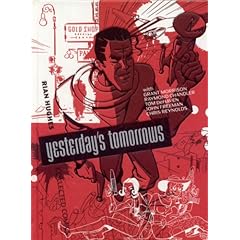
Yesterday's Tomorrows

Here's how this works. I read a book or two and tell you about them and try not to get too long-winded. This time, a review of Yesterday's Tomorrows (Knockabout, 2007).


Rian Hughes has long been absent from the field of comics, working instead in design and commercial illustration. When he was active in the late '80s through 1996 or so, he was creating some genuinely gorgeous work. This is a wonderful hardcover collection which reminds me of an old science textbook that reprints a good chunk of his comics, along with a heady set of sketchbook illustrations and cover art.

The two Grant Morrison collaborations, Dare (first serialized in Revolver and Crisis) and Really and Truly (from 2000 AD) are probably the best known pieces. They're both showing their age as stories, and certainly won't be remembered as being among Morrison's best works, but they look gorgeous. I could spend all day studying the backgrounds and details of Dan Dare's tragic, impoverished future, and its streets of empty future-buildings. The Science Service, written by John Freeman, is a very strange little one-off that gives Hughes lots of room to design his fun little retro-future, but the story left me a little cold, as though it was waiting for a good deal more meat and background before letting readers embrace it.

Standing head and shoulders above the rest, oddly enough, is Tom DeHaven's adaptation of the Raymond Chandler short story "Goldfish," in which Philip Marlowe needs to visit the Pacific Northwest to find a fellow who might know about some stolen pearls before a couple with a line in scalding bare feet with hot irons gets to him first. Now, it's certainly true that the three Chandler novels I've tried are not nearly enough, but I still had to wonder where this story had been all my life, because it's terrific. Hughes may seem an odd choice to illustrate something so firmly set in pre-war, small town America, when he took so much inspiration from
atom-age zap gun iconography, but he really nails this story, which is beautifully paced and comes as close to a definitive visual treatment for Philip Marlowe as I've ever seen.

Some of the writing lets Hughes down just a little bit, and some of his best comics are not included in this collection - next month's Reprint This! will have a note or two about that point - but in all, it's a very entertaining book full of beautiful art. The price might seem a little high, but the production is probably good enough to warrant it, so I give this a solid recommendation.