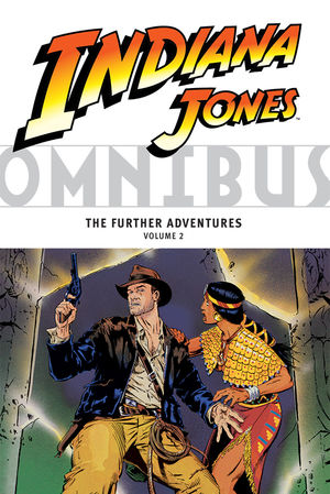
The history of Indiana Jones comic books is a long and often disappointing one, full of scattershot miniseries by rotating banks of creative teams. For my money, the best of all of them was Marvel Comics' Further Adventures of Indiana Jones in the mid-80s, but as this second Dark Horse omnibus demonstrates, even it had its share of flaws.
The omnibus is an attractive format; it reprints about 350 pages (15 issues) in color in a size just slightly smaller than the original comics. It's very good value for money at around $25. Yet the comics are anything but attractive. Between lazy, shortcut inking which tries to render entire crowds with the barest minimum of lines and the saturated, dayglow colors from a palette that screams "the 1980s," these are, emphatically, very ugly comics. I posted some particularly egregious examples from the first volume at my LiveJournal back in February. Several more can be found here; I don't know what possessed Marvel's colorists to just make a character and all his clothing red, or a huge crowd one solid pink, or set any of them on backgrounds of mustard yellow never seen in nature, but man, it looks hideous and sloppy and doesn't flatter the original linework at all.
The stories are pretty good. Several writers, principally David Michelinie with assistance and fill-ins from others, like veteran Larry Lieber, crafted some pretty good action-adventure hoops for Indy to jump through, with intricate conspiracies, nasty cults and weird, unknown civilizations. Sadly, however, none of the art rises above "workmanlike." Most of it is by Herb Trimpe, who, while mercifully no longer under instruction to try and copy Kirby, rarely finds any standout visuals. Jackson Guice, similarly, strides a line between "boring" and "what the script requires." Steve Ditko handles one fill-in with a minimum of enthusiasm; it's the best-looking episode in the book, but nowhere close to what I hoped a Ditko-drawn episode of Indiana Jones would look like.
That pretty much sums up the collection. I really got the impression that it was only Michelinie who took the assignment as the opportunity to create something memorable; those who worked with him didn't bring any fire-filled bellies to the table. As Indiana Jones adventures go, at least conceptually these aren't at all bad, and if you're willing to overlook the 1980s conventions of godawful coloring and characters who are constantly explaining the plot to themselves in thought bubbles, you can probably enjoy them for what they are. Recommended for Indiana's fans.
No comments:
Post a Comment