Here's how this works: I finish reading something, and I tell you about it, and I try not to bore you to death. This time, reviews of
Showcase Presents Legion of Super-Heroes volume two (DC, 2008) and
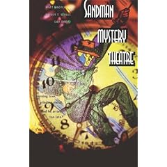
Sandman Mystery Theatre volume six (DC, 2008).

This is the second Showcase collection of 1960s LSH stories and it's pretty fun stuff, although unbelievably dated. It's more than just the design, although that's quite problematic itself. The Legion's "clubhouse" - a mysteriously bigger-on-the-inside rocketship which is routinely drawn as not much larger than a port-a-potty - is probably the worst offender, but the whole book is full of these dorky 1950s visions of the world to come, where everything that flies has huge tail fins and interior cabins with a lot more open space than a rocketship would need. Actually, the fact that I've had to use "rocketship" twice in one paragraph probably tells you everything you need to know about how emphatically 1950s all this stuff looks and feels.
I'm a lot harsher on this than I should be; it's very much a comic for children and it's done with so much more enthusiasm and verve than many other DC books of its time. There's still a strong degree of innocence and ignorance in its presentation and pacing - rocketing to another solar system is done with as much complication and complexity as bicycling down to the corner store on a lazy spring afternoon - but you can tell the writers wanted to make something of this sprawling cast of characters. Around the same time these were being printed, DC was also employing a fellow named Robert Kanigher, who just proudly regurgitated the same repetitive plots and tropes in the pages of his comics. By contrast, LSH seems to have accidentally repeated the same storyline about the new member turning out to be a traitor, and you can almost feel the embarassment on the page, a sense that the characters know that their naive trust is not just misplaced, but exploited by their enemies.
Much of the book continues in this vein, and is of principal interest to people who've been LSH fans for quite some time. But towards the end, in 1966, things suddenly get very interesting when Jim Shooter arrives as the new writer. Shooter was a high schooler at the time, and I recall reading somewhere that he decided to pitch for LSH because he believed that was the book most in need of help at the time. I won't say that he makes a quantum leap in storytelling when he arrives, since he was, like, fifteen years old then, and the retention of these deathly-dull
Dick and Jane illustrations prevents Shooter's vision from becoming "the shock of the new," but there's a marked and very interesting difference from what came before.
Across town, DC suddenly had a strong competitor in Marvel Comics, where Lee, Kirby and Ditko were crafting the best comics of the 1960s. That's where Shooter's mind was; that's where he'd later thrive. Shooter is much less wordy than his predecessors Edmund Hamilton and Jerry Siegel, using the comic space in a totally different way than they would. There are panels with only a single word balloon, with only a single sentence. That may seem unimportant to us, but after 450 headache-inducing word-filled pages, leaving as much room for the art as Shooter did really was novel. Unfortunately, the art is by the likes of Jerry Forte, Curt Swan and George Papp and not someone vibrant like Kirby, Colan or Heck, but at least Shooter is looking forward. (Actually, I see that Shooter actually did the layouts for these issues himself, and the final pages redone and inked by Swan, Papp and Sheldon Moldoff. Now that
is interesting.)
The storytelling is massively improved. Shooter's emphasis is on the heroes and their interactions, rather than long-winded schemes of aliens who look like accountants and their thought-bubble recollections of recent villainy. Most surprisingly for the time, Shooter's three issues - a two-parter and a one-shot - feature bad guys who actually get away to fight another time. Baddies in these old DC Comics were always either arrested by the space police and taken to space jail, or they met an unfortunate end as a result of their misguided actions. I'm not calling this stuff essential or anything, but it's pretty fascinating from a historical standpoint, and recommended to people with an interest in books from the period. The next volume, set for the spring, will have a lot more Shooter and should be a real winner.

I did a writeup on
Sandman Mystery Theatre a couple of years back, when four collections were available.
Go check that out for more information on the series. The sixth book was released this year, and I'm a little ambivalent about it, to be honest. It features two stories, and the first is a real firecracker. It's illustrated by Guy Davis and in it, our hero matches wits with another costumed adventurer from the late '30s, a fellow who takes a drug that gives him remarkable strength and endurance for one hour. Davis's work is just amazing. It sure isn't pretty - he captures people at their most mundane and ugly, setting himself at a blissful polar opposite from most mainstream American comic artists, who just want to draw supermodels - but his pacing, his likenesses, his architecture, his use of shadow and foregrounding and period detail are just perfect for this kind of story. It makes you long for a feature film adaptation.
Unfortunately, it's paired with a second four-parter which has not aged nearly as well. "The Python" features early work from Warren Pleece, who has since done far, far better work, including
Second City Blues for 2000 AD and the recent
Life Sucks with Jessica Abel. His work here is very amateurish and while Davis draws good pictures of ugly people, everybody in Pleece's pages is just plain ugly. The story's not as compelling as I remembered either, although the stunning stumble in Wes and Dian's new relationship is the real draw, and not the mystery, which wouldn't fool anybody. But what disappoints most, especially in light of DC's breathtaking restoration of
Starman, mentioned in the last
What I Just Read, is how dull and no-frills this book is. This is not surprising, particularly in light of the last decade-plus of half-assed Vertigo collections, but when you know the company can do a bang-up job with nice paper, introductions, supplements, commentary and background, it's a little disheartening to see the closest thing to a bonus is the original periodical cover used as a chapter break. And heck, in Starman they just gave the original artwork without all the text and ad copy on the front. Here, they just laid the original comic on a flatbed scanner. Get it together, Vertigo!
(Originally posted August 15, 2008 at hipsterdad's LJ.)


